Changing histograms into polygons, then into density curves

Histograms are also called “frequency histograms”
Earlier we learned about creating histograms by collecting the data in our set into small groups, and then graphing each group together. The grouping of data points is what makes it a histogram instead of just a bar graph. Each bar essentially shows the frequency of that group. In other words, in the histogram below,

Hi! I'm krista.
I create online courses to help you rock your math class. Read more.
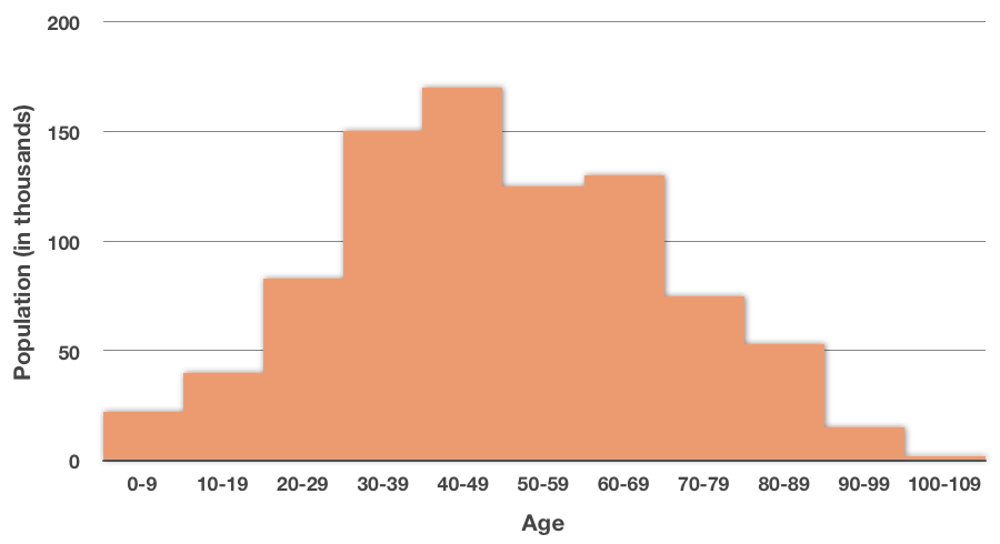
if we want to know the frequency at which ???30-39??? year-olds occur in the data, we just look at the bar to see that there are about ???150,000??? ???30-39??? year-olds in the data set.
For this reason, a histogram is often also called a frequency histogram, since it shows the frequency at which each category occurs.
Relative frequency histogram
We can also make a relative frequency histogram, which is the same as a regular histogram, except that we display the frequency of each category as a percentage of the total of the data.
In the histogram above, we’re showing the number of people in each interval, and there are ???865,000??? total people in the data set. To find the percentage of people represented in the ???30-39??? age group, we’d take the number of people in that group, ???150,000???, and divide by the total number of people in the data set, ???865,000???. We’d see that ???150,000/865,000\approx0.173???.
Which means that group represents about ???17.3\%??? of the data. If we repeat that process for the rest of the groups, then we can put the new data into a relative frequency histogram:
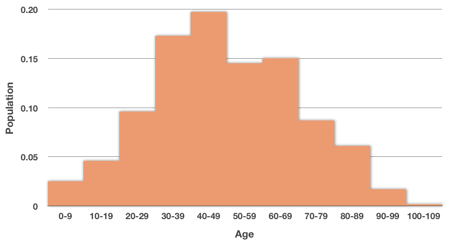
Notice that we marked off the ???y???-axis differently. We can see from this relative frequency histogram that the largest group in the data set is ???40-49??? year-olds, and that they represent just under ???20\%??? of the total population.
Frequency polygon
We can turn any histogram or relative frequency histogram into a frequency polygon by connecting the top of each bar with a line. Our relative frequency histogram becomes

Then we remove the bars, leaving only the line graph.
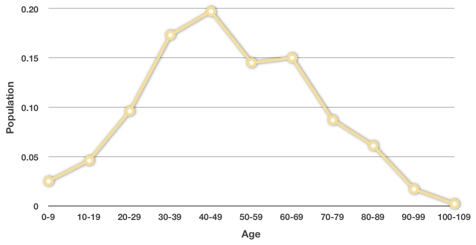
This is now a frequency polygon, so-called because it’s a polygon-shaped figure that shows the frequency at which each age range occurs in the data set. Frequency polygons are nice because they can give you a visual glance at the distribution of the data set.
How to change a frequency histogram, into a relative frequency histogram, then into a frequency polygon, and then into a density curve

Take the course
Want to learn more about Probability & Statistics? I have a step-by-step course for that. :)
Density curve
In the histogram we’ve been using, we had our data grouped into ???11??? categories based on age. From that, we were able to see the “density” of where most of our data was occurring. In this particular histogram, for example, most of the data occurs between age ???30??? and age ???69???.
If we were to use more and more categories, instead of just ???11???, until finally we were using infinitely many categories, and the bars in the histogram were infinitely thin, we’d be able to create a perfectly smooth curve by connecting the tops of each bar with a smooth line. This smooth curve is called a density curve.


a relative frequency histogram is the same as a regular histogram, except that we display the frequency of each category as a percentage of the total of the data.
There are a couple of important things we want to remember about density curves. First, the area under a density curve will always represent ???100\%??? of the data, or ???1.0???. The curve will never dip below the ???x???-axis.
If we want to know how much of our data falls within a certain interval, then we want to look at the amount of total area that falls under the curve within that interval. As an example, if we want to know how much of the population is roughly age ???70??? and older, we’re looking at the area under the curve on that interval:

We’re estimating here, but that looks like it might be roughly ???25\%??? of the total area under the curve, so we might say that about ???25\%??? of our population is age ???70??? or older.